Textile Color Theory and Color Difference Evaluation
In textile dyeing technology, achieving the desired fabric color involves far more than simply applying dyes to fibers. The final visual appearance of a textile is determined by the combined interaction of light, material structure, human vision, and color measurement standards. Building upon the principles of textile dyeing and coloration processes discussed previously, understanding color perception and color evaluation is equally essential for ensuring dyeing consistency, shade accuracy, and product quality. This article introduces the fundamental principles of color perception, the characteristics of light sources, color classification systems, and modern textile color measurement methods used throughout the textile industry.
Contents
The Three Essential Elements of Color Perception
For an object to appear colored, it relies on the synergistic interaction of three elements—”light source, object, and vision (brain)”—all of which are indispensable:
● Light Source: A light source is a form of electromagnetic radiation; specifically, the “visible light” spectrum perceptible to the human eye spans a wavelength range of 380–780 nm (e.g., sunlight, artificial lighting). When a light source illuminates an object, the object interacts with the light—depending on its specific wavelengths—by reflecting, absorbing, or transmitting it.
● Object: The intrinsic structure and composition of an object determine how it interacts with light.
● Vision (Brain): After being reflected by the object, light enters the human eye. It passes through the cornea, aqueous humor, lens, and vitreous humor before being focused onto the retina. There, photoreceptor cells convert the light stimuli into neural impulses, which are then transmitted via the optic nerve to the brain’s visual centers, ultimately resulting in the perception of color.
Characteristics of Light Sources

The visible spectrum color wheel plots wavelength along the horizontal axis (ranging from 380 nm to 780 nm), corresponding to various colors (e.g., 380–450 nm for violet, 450–480 nm for blue, 550–570 nm for yellow, and 627–780 nm for red). Its core characteristics include:
● Continuous variation of monochromatic colors: Each color corresponds to a specific range of wavelengths, and the boundaries between different colors are not strictly defined (e.g., there is no distinct demarcation between blue and blue-green);
● Perception of monochromatic color varies with light intensity: Light of a single wavelength (such as yellow light at 589 nm) appears brighter at high intensities and dimmer at low intensities;
● Most light in nature is polychromatic: The light people encounter in daily life (such as sunlight or artificial lighting) is not monochromatic light of a single wavelength, but rather a mixture of light waves across multiple wavelengths (e.g., sunlight is a blend of various colors, including red, green, and blue).
Sort by color
Colors can be classified into two categories: “achromatic colors” and “chromatic colors”:
Achromatic Colors
Composed of white, black, and various shades of gray. Their perceived color is determined by their “visible spectrum reflectance”—a reflectance of 80% or higher is classified as white, less than 4% as black, and between 4% and 80% as the gray spectrum (theoretically, a reflectance of 100% corresponds to pure white and 0% to pure black, though these extremes are difficult to achieve in practice).

Chromatic Colors
:Refers to all colors other than achromatic colors (such as red, green, blue, yellow, etc.), possessing the three primary characteristics of lightness, saturation, and hue.

The Three Major Characteristics of Color

Lightness
Refers to the intensity of light reflected from the surface of a colored object; it is primarily used to distinguish the “lightness” or “darkness” of a color. For example, given two shades of red, the one reflecting stronger light appears lighter (high lightness), while the one reflecting weaker light appears darker (low lightness). This can be determined by comparison with a standard sample (e.g., appearing darker or lighter than the standard).
Chroma
Refers to the degree to which a color deviates from a neutral color (gray) of the same lightness—essentially, the “vividness” of a color. Colors with high chroma are more vivid (e.g., a pure red), while colors with low chroma are more muted (e.g., a grayish-red). When comparing against a standard sample, one can observe differences indicating whether a color is “brighter” (high chroma) or “duller” (low chroma).
Hue
Refers to the fundamental attribute of a color and serves as the primary basis for distinguishing between different colors (e.g., the difference between red, green, and blue). A color wheel provides a visual representation of the distribution of various hues; when comparing against a standard sample, hue deviations—such as appearing “too green” or “too red”—may be observed (for instance, if the standard sample is a pure yellow, the actual sample might appear slightly orange-yellow or greenish-yellow).
Primary Colors
Primary colors refer to fundamental colors that cannot be produced by mixing other colors, yet can be mixed together to create a wide variety of other hues. They are categorized into “additive primary colors” (light primaries) and “subtractive primary colors” (object primaries).
Additive Primary Colors
These consist of red, green, and blue, with corresponding wavelengths of 700 nm (red), 546.1 nm (green), and 435.8 nm (blue), respectively. By mixing these three light colors in varying proportions and intensities, a full spectrum of light colors can be produced.

Subtractive Primary Colors
These refer to the fundamental colors of non-luminous objects—such as pigments or fabrics—and include magenta, cyan, and yellow. While these three colors can be mixed to create a diverse array of hues, they cannot be combined to produce a pure black.

Methods and Principles of Color Measurement
Visual estimation method
Directly comparing the color differences between a standard sample and a batch sample (test sample) using the human eye is a common practice; however, it is subject to significant limitations and influencing factors.
Two core limitations
The standard sample and the batch sample must be placed side-by-side to enable an accurate comparison; once separated, it is impossible to make a reliable judgment based solely on memory.
There is a lack of unified quantitative standards, and subjective factors exert a significant influence (e.g., different individuals possess varying degrees of color sensitivity).
Common influencing factors
Directional Effects: Variations in the orientation of the fabric’s weave result in differing angles of light reflection, thereby creating the visual impression of color discrepancies.
Surface Structure Effects: Differences in the fabric’s surface smoothness or degree of surface fuzziness alter the manner in which light is reflected, leading to deviations in color perception.
Computerized color measurement
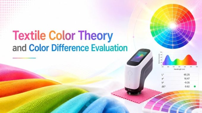
Color differences are quantified using specialized equipment (such as spectrophotometers), relying primarily on the CIE colorimetry system to define specific “tolerance ranges,” thereby ensuring a high degree of objectivity. The color difference between a Standard Sample (STD) and a Batch Sample (BAT) is calculated using specific formulas; the key parameters are defined as follows:
△L*: Represents the difference in lightness. A positive result (+) indicates that the Batch Sample is lighter than the Standard Sample; a negative result (-) indicates that the Batch Sample is darker than the Standard Sample.
△a*: Represents the difference in red-green hue. A positive result (+) indicates that the Batch Sample is redder; a negative result (-) indicates that the Batch Sample is greener.
△b*: Represents the difference in yellow-blue hue. A positive result (+) indicates that the Batch Sample is yellower; a negative result (-) indicates that the Batch Sample is bluer.
△E*: Represents the total color difference—that is, the overall magnitude of the color discrepancy between the Batch Sample and the Standard Sample. A higher numerical value indicates a greater difference. Different △E* values correspond to varying degrees of color difference acceptability. The tolerance ranges are defined as follows (based on △E* values):
△E* = 0.00: Perfect match; the color of the Batch Sample is completely identical to that of the Standard Sample.
△E* = 0.3–0.5: Slight difference; the human eye requires close scrutiny to detect it, and it is generally considered acceptable.
△E* = 0.7–1.1: Acceptable difference; the human eye can clearly perceive the difference, but it falls within industry standard ranges and does not affect usability.
△E* > 1.5: Unacceptable match; the color difference is significant, fails to meet requirements, and necessitates a readjustment of the dyeing process.

Common illuminants for textiles
Color measurement must be conducted under a specific light source (illuminant). Different light sources serve different purposes; common types are as follows:
● D65: A filtered tungsten lamp designed to simulate natural daylight; it serves as the standard light source for textile color measurement and is suitable for most routine testing.
● TL84: European commercial fluorescent lamps that simulates the lighting environments found in European retail stores and offices. It is used to assess how fabrics appear under typical European daily lighting conditions.
● CWF: An American commercial fluorescent lamp that simulates the lighting found in U.S. retail stores and offices. It is suitable for color testing textiles intended for export to the United States.
● UV: Commonly known as a “black light,” this source emits ultraviolet light and is primarily used to evaluate the effects of optical brighteners and fluorescent dyes in fabrics (e.g., to determine whether an excessive amount of brightener has been added).
● A: A tungsten-halogen lamp (incandescent light) that simulates the accent lighting environments typically found in homes and retail stores. It also serves as a standard light source for “metamerism testing” (assessing whether a fabric’s color changes when viewed under different light sources).
Conclusion
Textile coloration is not solely a chemical dyeing process but also a scientific process of visual perception and color evaluation. While dyeing technology determines how dyes bond with fibers, color science determines how those colors are ultimately perceived under different lighting conditions and viewing environments. Concepts such as lightness, chroma, hue, and color difference measurement provide the foundation for modern textile color control and quality assurance. By combining precise dyeing technology with standardized color measurement systems, textile manufacturers can achieve greater color consistency, reduce production errors, and meet increasingly demanding international quality standards.
Copyright Notice: Some materials are sourced from the internet. If any copyright issues arise, please contact us, and we will address them immediately.